Why DTF printing Background Color Matters So Much
In DTF, the background isn’t just space. It’s an active layer that influences everything:
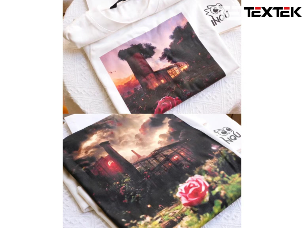
- Contrast & Readability: This is the big one. A light-colored design on a light background will disappear. A dark design on a dark background will lose all its definition. The right background makes your design instantly clear and visible.
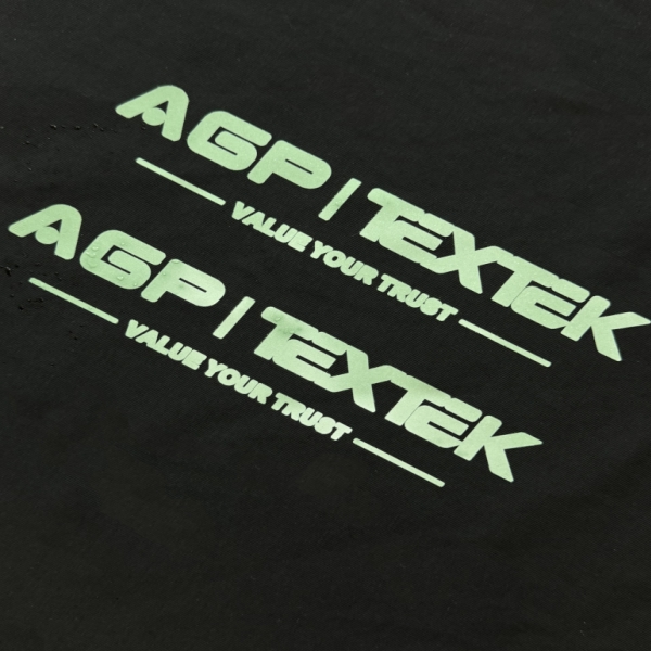
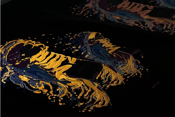
- Color Vibrancy: The background color can intensify or mute your design’s colors. A white base makes colors appear brighter and truer, while a black base can make neon inks look electric.
- Ink Behavior: The wrong color combination can sometimes lead to issues like bleeding or a muddy look, especially if the contrast isn’t managed well during printing.
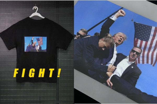
- The Right Vibe: Your background sets the tone. Soft pastels work for baby clothes, bold black fits streetwear, and clean white looks professional for brand logos.
Simple Steps to Pick the Perfect Background
Stop guessing. Follow this practical process every time.
Step 1: Look at the Shirt Color First.
This is your starting point. Is the garment light or dark?
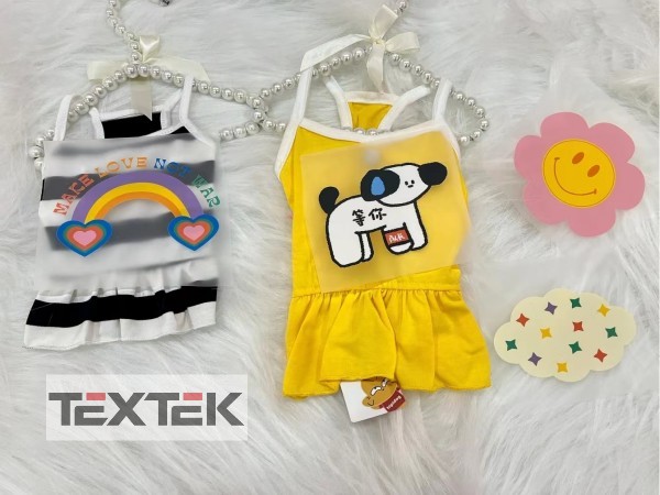
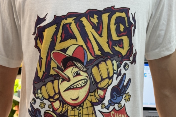
- Light Shirt: You can use a white background for a seamless look or a dark background for high contrast.
- Dark Shirt: You will almost always need a white underbase to make your colors pop.
Step 2: Test Your Contrast Digitally.
Before you print, mock up your design in your software (like Photoshop or Canva).
- Switch the background color and see how it looks.
- Is the text still easy to read?
- Do the important details stand out clearly?
- Pro Tip: Zoom out until your design is the size of a postage stamp. If it’s still clear and legible, you’ve got good contrast.
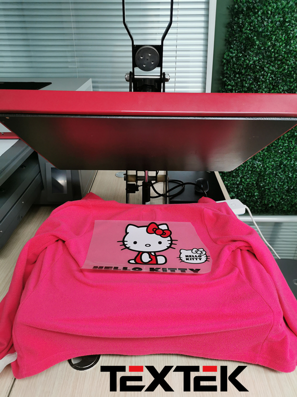
Step 3: Print a Test. Always.
Your computer screen lies. The only way to know for sure how a color will look is to print a small sample.
A test print reveals everything:
- True color accuracy
- Sharpness of fine details
- How the colors feel on the actual fabric
If you can’t do a test print, at least get a second opinion. Fresh eyes often catch contrast issues you might have missed.
Choosing the right background color for DTF printing is a simple but powerful skill. It’s the difference between a print that looks homemade and one that looks professionally made.