One of the most common frustrations in the DTF (Direct-to-Film) industry is the "color gap"—when the vibrant design on your computer screen looks dull, muddy, or completely different once printed on a t-shirt. Achieving color accuracy isn't a matter of luck; it’s a science.
In this guide, we will break down the essentials of DTF color management, the critical role of ICC profiles, and how to ensure your prints match your vision every single time.
Understanding the "Color Gap": RGB vs. CMYK
To master color, you must first understand how your devices "speak" color. Most digital designs are created in RGB (Red, Green, Blue), which is the color space used by monitors and screens. However, DTF printers operate in CMYK (Cyan, Magenta, Yellow, and Key/Black).
The challenge arises because the RGB color gamut is significantly wider than the CMYK gamut. This means there are bright, neon, or highly saturated colors that a screen can display, but a printer simply cannot replicate with physical ink. Effective color management is the process of "translating" these digital signals into precise ink droplets to minimize this discrepancy.
What is an ICC Profile and Why Do You Need It?
.jpg)
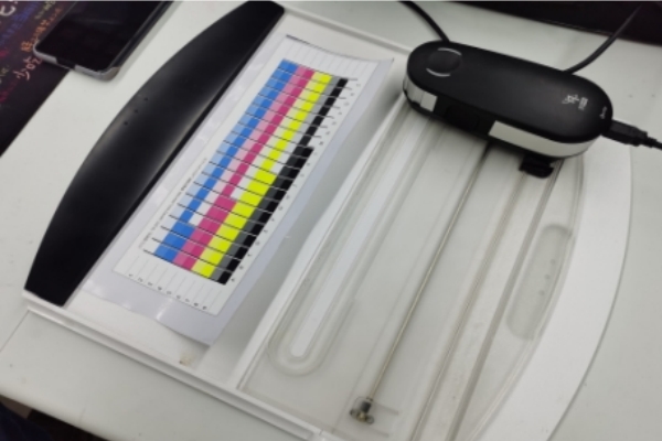
An ICC Profile (International Color Consortium) is essentially a digital "translator" or a map. It tells your printer exactly how much of each ink (CMYK) to use to achieve a specific color on a specific film under specific settings.
Without a proper ICC profile, your printer is essentially guessing. This leads to common issues such as:
•Skin tones appear orange or grey.
•Deep blacks looking like dark brown or navy.
•Vibrant reds are turning into a dull brick color.
A high-quality ICC profile is tailored to your specific combination of ink brand, PET film type, and RIP software settings. If you change your ink supplier but keep the same profile, your colors will likely shift.

How to Implement Professional Color Management
Achieving "perfect" color requires a consistent workflow from the design stage to the final cure.
1. Calibrate Your Monitor
Before you even start designing, ensure your monitor is calibrated. If your screen is displaying colors incorrectly, you are designing based on a lie. Professional designers often use hardware calibration tools (like a Spyder or X-Rite) to ensure their "on-screen" white is truly white.
2. Design in the Correct Color Space
While many RIP softwares can handle RGB files, it is a best practice to design in CMYK or at least use "CMYK Preview" in Adobe Illustrator or Photoshop. This allows you to see which colors are "out of gamut" before you ever hit print.
3. Load the Correct ICC Profile in Your RIP Software
Your RIP (Raster Image Processor) software, such as AcroRIP, Cadlink Digital Factory, or Mantis, is where the ICC profile is applied.
•Installation: Most profiles come as .icc or .icm files. You must import these into the "Color Management" or "Output Profile" section of your RIP software.
•Matching Settings: Ensure your print resolution (e.g., 1440x1440 dpi) and ink density settings match the conditions under which the ICC profile was created.
Troubleshooting Common DTF Color Issues
Even with a profile, you may encounter color shifts. Here is how to diagnose and fix them without using complex charts:
•Clogged Print Heads: If one color (like Cyan) is partially clogged, the entire color balance will shift toward Red/Yellow. Always perform a Nozzle Check before starting a production run.
•Ink Sedimentation: DTF inks, especially White and Magenta, can settle over time. If the ink isn't agitated, the pigment concentration changes, leading to inconsistent colors. Shake your ink tanks gently every day.
•Film Side Issues: Printing on the wrong side of the DTF PET film or using low-quality film with poor coating can cause the ink to bleed or "pool," which distorts the intended color.
•Curing Temperature: Over-curing your transfers in the oven can "scorch" the ink, leading to a yellowed or darkened final result. Stick to the manufacturer's recommended time and temperature.
Conclusion: Color Accuracy is Your Competitive Edge
In the crowded custom apparel market, the ability to deliver consistent, vibrant, and accurate colors is what separates professionals from hobbyists. By implementing a robust color management workflow—centered around high-quality ICC profiles—you reduce waste, save time, and ensure that every customer receives exactly what they saw on their screen.
Mastering your colors isn't just about aesthetics; it's about building a reliable brand that customers can trust for their most important projects.
Pro Tip: Always keep a "Master Color Swatch" printed on a standard garment. Whenever you change inks or films, print a new swatch and compare it to your master to detect any subtle color shifts early.
FAQ: Frequently Asked Questions
1. Why do my DTF prints look different from my screen?
This is usually due to the difference between the RGB (screen) and CMYK (printer) color spaces, or the lack of a calibrated ICC profile to translate the colors accurately.
2. Where can I get an ICC profile for my DTF printer?
Most reputable DTF ink and film suppliers provide free ICC profiles specifically for their products. You can also create custom profiles using a spectrophotometer.
3. Does the film type affect the color?
Yes. Different PET films have different coatings that absorb ink differently. A "cold peel" film may yield slightly different color vibrancy compared to a "hot peel" film using the same ink.

.jpg)

