Our quality products and best service will make your business much better.
Professional . Specialized . Experienced
(English)
14
Oct
.jpg)
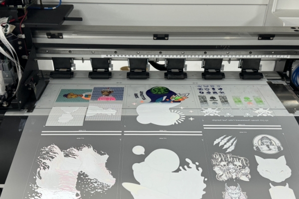
If you work with DTF printing, you already know its power: brilliant colors, sharp details, and the ability to print on almost any fabric. But there's one simple choice that can lift your print from "good" to "absolute knockout"—the background color.
Think of the background as your design's foundation. Get it right, and your colors pop, your details stay crisp, and the final product looks professional. Get it wrong, and even the best design can fall flat.
This isn't just about taste; it's a technical and strategic decision. Let's break down how to choose the perfect background color to make your DTF prints shine.
In DTF, the background isn't just space. It's an active layer that influences everything:
Contrast & Readability: This is the big one. A light-colored design on a light background will disappear. A dark design on a dark background will lose all its definition. The right background makes your design instantly clear and visible.
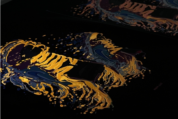
Color Vibrancy: The background color can intensify or mute your design's colors. A white base makes colors appear brighter and truer, while a black base can make neon inks look electric.
Ink Behavior: The wrong color combination can sometimes lead to issues like bleeding or a muddy look, especially if the contrast isn't managed well during printing.
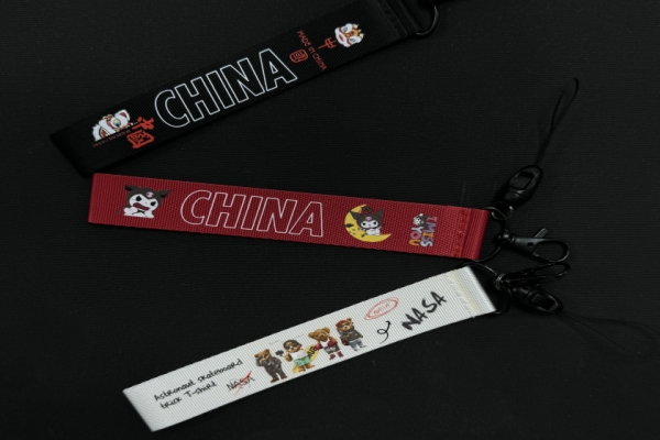
The Right Vibe: Your background sets the tone. Soft pastels work for baby clothes, bold black fits streetwear, and clean white looks professional for brand logos.
Here's a straightforward look at the most common background choices and the situations where they excel.
1. The All-Star: White Background
Best for: Light-colored garments (white, cream, pastel yellow, etc.).
Why it works: On a light shirt, a white background blends in seamlessly. It acts as a bright, neutral canvas that makes your design colors look exactly as you intended—vibrant and true. This is your default, go-to choice for light fabrics.
2. The Heavy Hitter: White Underbase for Dark Garments
Best for: Black, navy, charcoal, or any dark-colored garment.
Why it works: This is the most important technique for dark shirts. You print a solid white layer first (the "underbase"), then print your colors on top. This white layer blocks the dark shirt from showing through and gives your colors a bright base to pop against. Never skip the white underbase on dark fabrics if you want vibrant, opaque colors.
3. The Bold Statement: Black or Dark Background
Best for: Creating a specific, high-contrast aesthetic, often on light garments.
Why it works: A solid black background makes bright and neon colors look incredibly intense and modern. It's perfect for achieving that "edgy" streetwear look. Remember, if you're putting this on a dark shirt, you still need that white underbase beneath the entire design, including the black areas.
4. The Creative Touch: Gradient or Patterned Background
Best for: Artistic designs, abstracts, and high-fashion looks.
Why it works: It adds depth and a unique, custom feel that a solid color can't match.
The Catch: These can be trickier to print perfectly and might require more testing to avoid color blending issues.
Stop guessing. Follow this practical process every time.
Step 1: Look at the Shirt Color First.
This is your starting point. Is the garment light or dark?
Light Shirt: You can use a white background for a seamless look or a dark background for high contrast.
Dark Shirt: You will almost always need a white underbase to make your colors pop.
Step 2: Test Your Contrast Digitally.
Before you print, mock up your design in your software (like Photoshop or Canva).
Switch the background color and see how it looks.
Is the text still easy to read?
Do the important details stand out clearly?
Pro Tip: Zoom out until your design is the size of a postage stamp. If it's still clear and legible, you've got good contrast.
Step 3: Print a Test. Always.
Your computer screen lies. The only way to know for sure how a color will look is to print a small sample.
A test print reveals everything:
True color accuracy
Sharpness of fine details
How the colors feel on the actual fabric
If you can't do a test print, at least get a second opinion. Fresh eyes often catch contrast issues you might have missed.
Use the Color Wheel: Colors opposite each other (like blue and orange or purple and yellow) create natural, vibrant contrast.
Stick to the Brand: If you're printing for a business, their brand colors are non-negotiable. Your job is to make them work.
Keep it Clear: High-contrast designs aren't just striking—they're also more accessible and easier for everyone to see.
Choosing the right background color for DTF printing is a simple but powerful skill. It’s the difference between a print that looks homemade and one that looks professionally made.
By understanding the shirt color, using contrast to your advantage, and always testing first, you can eliminate costly mistakes and ensure every single one of your DTF prints looks its absolute best. Now go make something amazing.


